“Bubblicious” evidence is blindingly glaring when one examines the disconnect between S&P 500 stock prices and corporate profits. In the late 1990s, stocks rocketed (green line), even as profits had flatlined (red line).
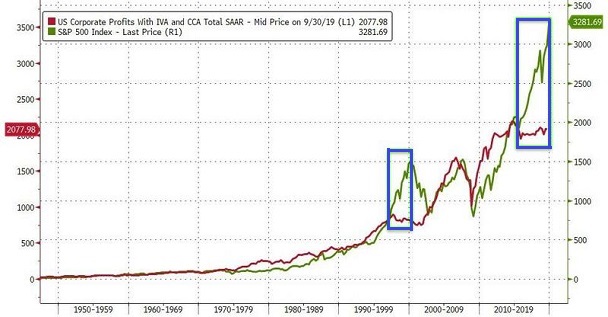
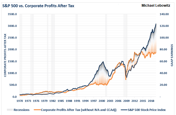
In the late 2010s? Same exact thing. The market has soared (green line) despite profits flatlining (red line). The classic stock bubble dynamics can be seen in a similar chart by Michael Lebowitz below.